I’ve been accused of a few things in my time on this planet, but one charge I rarely get is:
“Daniel, you’re just too conventional. Try thinking just a little bit outside of the box for once”.
So it’s been in this spirit of self-embraced eccentricity that when setting up a new tech blog recently, I decided to roll a bit with the quirky theme of the very interesting CMS that I’ve been building this, and other sites, with (Astro CMS, link below).

Astro’s branding encourages users to see themselves as astronauts (Astro, get it?) and has a space-centric branding.
For reasons that are probably no deeper than that sloths are almost impossibly cute, I have a fondness for watching sloth videos in the same way that most people watch cat videos on YouTube (it’s reputed that I’m also the creative force behind the Jerusalem Sloth Instagram account but I can’t divulge all my secrets at once)
So I’ve decided to sprinkle my tech blogs with a few … sloth graphics. For those curious, today’s crop were made with OpenArt.AI (AKA DALLE 3).
Speaking of Open AI, while it’s been a while since I procrastinated by getting DALLE to cook up weird animal-themed things, I’ve been making lots of real use lately for ChatGPT.
Astro is a bit more code-heavy than “conventional” CMSes like Wordpress (although I’m reminding myself frequently that even to make good use of Worpress, you have to get your hands dirty with PHP some of of the time).
But my CSS skills in particular have gotten a little rusty from years of neglect.
Not only can ChatGPT help fix broken Kubernetes clusters and cook up (competely functional) yaml automations for use with Home Assistant (that work!), you can basically present it with a tech request (like: I’d like to use a new font for my blog) and it will tell you how to get from A to B.
Today I asked it something like this:

And here’s what it chipped back with:
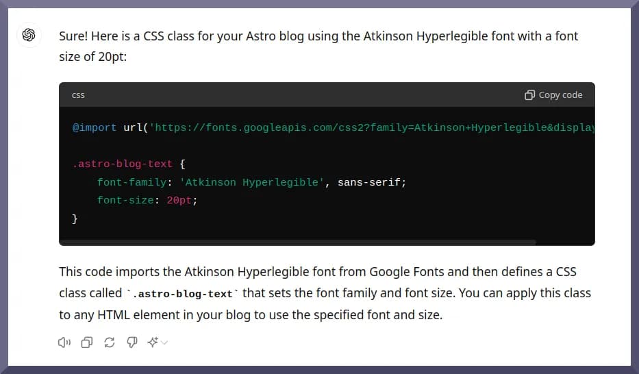
I’m quickly coming to see ChatGPT as a sort of companion-instructor as I go about my workday
(No, I do not and will hopefully never regard AI as a ‘friend’! Our relationship is purely platonic!).
It often gives me everything I need to achieve my objective (hence it’s a fixer) but it also a patient teacher of sorts talking me through all the code snippets it suggests as it offers them up.
It’s been so helpful that I’ve upgraded to premium. It’s already more than paid itself off in saved time.
Table of Contents
Open Table of Contents
- What’s ‘Impact’? And What Kind Of Data Does It Generate?
- And Now, A Chart To Look At …
- Currently, Accounting Dismisses Non-Financial Effects
- Data Transparency Should Start With Those Asking For It
- The Problems With Reports As A Normative Mechanism For Data Sharing
- Communicating What Matters To Those Who Care
What’s ‘Impact’? And What Kind Of Data Does It Generate?
But getting back to today’s post (with a rhetorical question to help get me started):
As I’ve mentioned in a couple of recent posts, I’ve spent a vast amount of time over the past few months working on a data visualisation project (from conversations with friends,I still can’t yet tell whether that sounds impressive, woefully boring, or just complicated. Fortunately for them, I try not to talk about work socially).
If you feel so inclined, please check it out, with the caveat that it’s very much in its early days (if the site’s online, I’m ahead of the game. Some degree of typos and non-perfection should be anticipated)

As I’ve been at pains to emphasize, it’s also not-for-profit.
Indulging in learning about data, and looking at it, is the only motivator I could point to as besides what’s written on the tin.
In spite of this, even approaching other non-profits to use their data for a non-profit objective feels a bit … odd at times.
If I had absolutely no cares about what people thought of me (who knows, I may get there one day), I might even end my emails with all caps:
I’M NOT TRYING TO STEAL YOUR DATA AND SELL IT TO GOOGLE, I PROMISE!
And Now, A Chart To Look At …
Anyway …
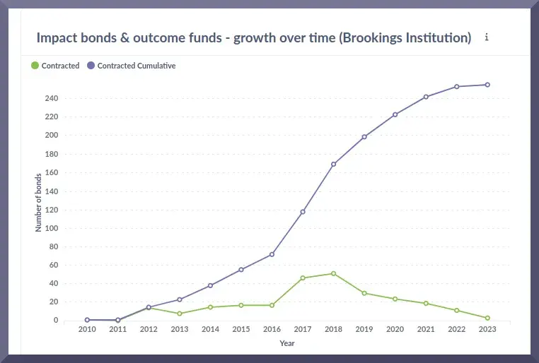
Here’s a data chart showing the issuance of impact bonds - a type of security (financial product) that enables private investors to work with governments in tackling social ills.
The first impact bond aimed to tackled recidivism (reoffending) in a population of recently released prisoners.
Two chief variants exist which vary depending upon the nature of the so-called ‘outcomes payer’ (social impact bonds / SIBs and development impact bonds / DIBs). However, other spinoffs (like career impact bonds / CIBs for upskilling) have been deployed.

While impact bonds have attracted scrutiny and in some cases criticism, their fundamental proposition is quite extraordinary and (sorry to lapse into jargon, this is really the best way I can think of putting it) paradigm-shaking.
We’re used to thinking of private investors as out for their own skin (ie, self-enrichment) and governments as responsible for ‘fixing’ what’s broken (libertarians excepted).
While capitalism innovates, our current system of reckoning value allows them to avoid paying any of the bill for the damage they might cause the planet while doing their money-making thing.
The entrepreneurs may become wealthy and so, to a lesser extent, may their employees. But painful effects can be borne by those who actually use the product, by those engaged in the supply chains they operate, and even, in some instances, by the workforce itself (poor compensation; unwritten promotion practices that reinforce social divides).
Companies are a pivotal force in our societies. And all those little ‘impacts’ (the hitherto ‘externalities’) add up to huge forces. As we have seen, enough of them can even lead our planet to the brink of its sustainability boundaries and then well beyond them. Leading, among other things, to urgent initiatives such as the 2030 SDGs:
In planetary term times, 2030 is one-tenth the blink of an eyelid away. Its aims are better understood as emergency intervention than anything approaching long-term policymaking.
So our current modus operandi might be summarised as that one set of actors creates wealth for themselves but often does so at the expense of completely different people on the other end of the planet.
Or those next door.
Currently, Accounting Dismisses Non-Financial Effects
I grew up in Cork, Ireland and - like an unusually high number of my peers - developed asthma at a young age.
I’ve been as asthmatic for so long that I consider asthma a simple fact of life and forget at times that most people don’t have to take an inhaler once a day to keep breathing.
Cork has an unusually high incidence of the lung disease and fingers have often been pointed at nearby industry as probable culprits.
In the lore of accounting, such effects were once termed ‘externalities’ - a single word which spoke volumes about the importance those determining the practice of reckoning value attached to them.
Times have evolved and environmental, social, and governance (ESG) criteria have been suggested as a set of metrics to quantify companies’ performance towards sustainability objectives.

Alongside politicisation, so-called ‘greenwashing’ has emerged as a thorn in ESG’s side. But the concerns around it speak to a much more pertinent issue: Whether any level of safeguards can be put in place that can make it reasonable to expect companies to report on their own sustainability performance fairly.

Much of impact investing invites us to imagine a world in which the division between private capital and public capital (like government money) weren’t so stark.
One in which companies didn’t make money and then try apologetically to clean up the damage(by starting philanthropic wings or doubling down on their commitment to ESG, for instance), but one in which they didn’t create the damage in the first place.
Where ESG tries to get companies to widen their view to see their environmental effects (among others) as part of their remit, impact posits a more preventative mechanism that asks companies not to create negative impacts in the first place.
Impact investing (which tries to harness this thinking in impact decision-making) tries to bring this towards a lofty endpoint: It aspires to see the growth of companies that are true hybrids, both financially prosperous while also doing good for the word.
So the ‘impact bond’ sits within this context. And although eclipsed in valuation by other newer financial vehicles that try to link the flow of money to one’s overall sustainability performance, it remains the subject of ongoing interest among governments, policymakers, and those, like think tanks and NGOs, interested in exploring new avenues.
And thanks to the fine work of the people over at The Brookings Instiution we can discern some interesting trends about the issuance of impact bonds that aren’t quite so immediately apparent when looking at the data in tabular format.
The plot is a function of Brooking’s unique methdology for quantifying ‘impact bonds’ which doesn’t rely on public sources or even self-appellations (in other words, they make that determination themselves),
I would regard it as fundamentally cautious but add that I think that that’s a good thing.
Suggested insight:
While the overall issuance volume of impact bonds has crept up steadily over the years since they began tracking them (that’s the purple line that keeps growing) the year-on-year issuance volume has been on a sort of flat-lining trajectory since about 2018 (that’s the green line that charts a less inspiring trend).
If we zoom in a bit, we can identify where the pivot seems to occur:
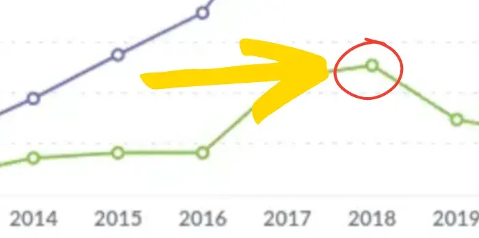
To some extent, the continuation of the dip through to last year (2023) is probably attributable to the fact that gathering this data tends to be a bit retrospective (until data is collected it doesn’t exist in the database and data gathering can take a while).
But even if it doesn’t self-heal to some extent through revision, it may also speak to an actual slowdown in issuance that is noteworthy.
Here’s the raw data in its original tabular format:
| Contract Year | Contracted That Year | Cumulative Volume Contracted |
|---|---|---|
| 2016 | 17 | 55 |
| 2017 | 46 | 118 |
| 2018 | 51 | 169 |
| 2019 | 30 | 199 |
| 2020 | 24 | 223 |
Table: Issuance of impact bonds per year and cumulatively. Source: Brookings Institution, SIBs By The Numbers.
Seasoned analysts might be able to quickly pick off the change in 2018.
But I think that for the rest of us, and for those with limited attention spans, a little charting can go a long way*.
Such charting, in turn, in only jumping off point. While the sample size of bonds is small, there may be insight here. Questions to ask might be: what happened in 2018 that may have prompted a loss in appetite for these securities?
By asking questions, we slowly inch towards building an understanding that resembles something more liek the truth.
(*Just not all of the way: I’m mindful of the fact that a deluge of visualisations is no more helpful than reams of statistics or mountains of paper. And in trying to ‘tell the story’ of impact through its data, it’s only one tool in the arsenal).
Data Transparency Should Start With Those Asking For It
As a long-time ardent fan of the open-source movement, and a former sometimes journalist/writer type, it’s been my take that the impact investing movement is a little behind the curve in sharing the data that it generates.
The intersection of people who are interested in communications and data visualisation isn’t enormous. So this might be the product of the peculiar lens through which I see this industry. Or it might be a widespread feeling.
Some morsels of (much-needed) validation were provided by a couple of conversations with journalists who wanted snappy data sources to validate some of the rhetoric in the space.
I could picture myself on their side of the table reluctantly giving up on a story because nobody has days to dedicate towards digging through reports. Perhaps our (sort of) ideological rival (ESG) had put a lot more effort into sharing information.
Moreover:
A central thesis of impact investing is that if companies’ performance data were more transparent, we could change how the world of finance operates.
Much of the work of the International Foundation for Valuing Impacts (IFVI) marches to this drumbreat (and the IFVI is doing important work in sharing case studies and findings.)
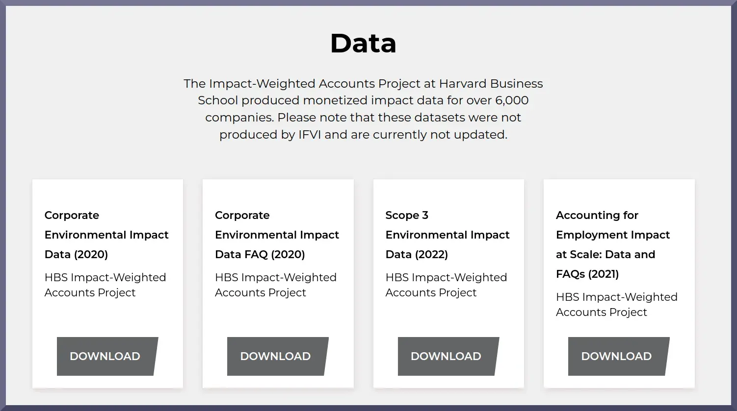
It seemed self-defeating to me not to be investing a concerted effort in improving the transparency of the data that we generate.
The journalists I spoke to, I realised, weren’t looking for lengthy reports filled with obscure acronyms and references to regulatory processes. They wanted to see some evidence that the changes we were selling really “worked” - even at a small level of scale.
Asking them to take the time to read a mountain of paperwork just to feel confident that they had done adequate background for fact-checking was a bit like handing a prospective customer an encyclopedia instead of answering a simple question. They wanted a quick cut-and-dried summary of how well (or poorly) a certain intervention went.

I didn’t have something to offer that I felt was a great resource to share. Truth be told, I still don’t. So I decided that even a small attempt to create something would be a worthy investment of time.
My boss was supportive of the idea and I’ve had the luxury of being able to dedicate on-the-clock time to building even a basic proof-of-concept (less fortunately: a couple of weekends have been spent on database-related things, but I’ve enjoyed the learning journey).
The Problems With Reports As A Normative Mechanism For Data Sharing
To the best of my knowledge, there aren’t wellsprings of data about impact projects just waiting to be analysed.
In data terms, I don’t think our industry has a big data problem or anything approaching it.
I would suggest that this is mostly a good thing.
Our problem isn’t finding a way to gather and store exobytes of data from the “ecosystem”.
It’s (rather) about gathering what’s already been collated about the outcomes of relatively small-scale interventions. On the downside, the sample sizes tend to be small which makes it hard to think of the ideas as going beyond proof-of-concept. On the plus side, even basic analysis is approachable.
The issue, as I see it, has much more to do with communications and mode of presentation than it has to do with the data itself.
Even with great intentions, it’s easy for working groups, committees, boards, and reports to all wildly mushroom into a porpourri of bureaucracy.
And then we end up in something like this:
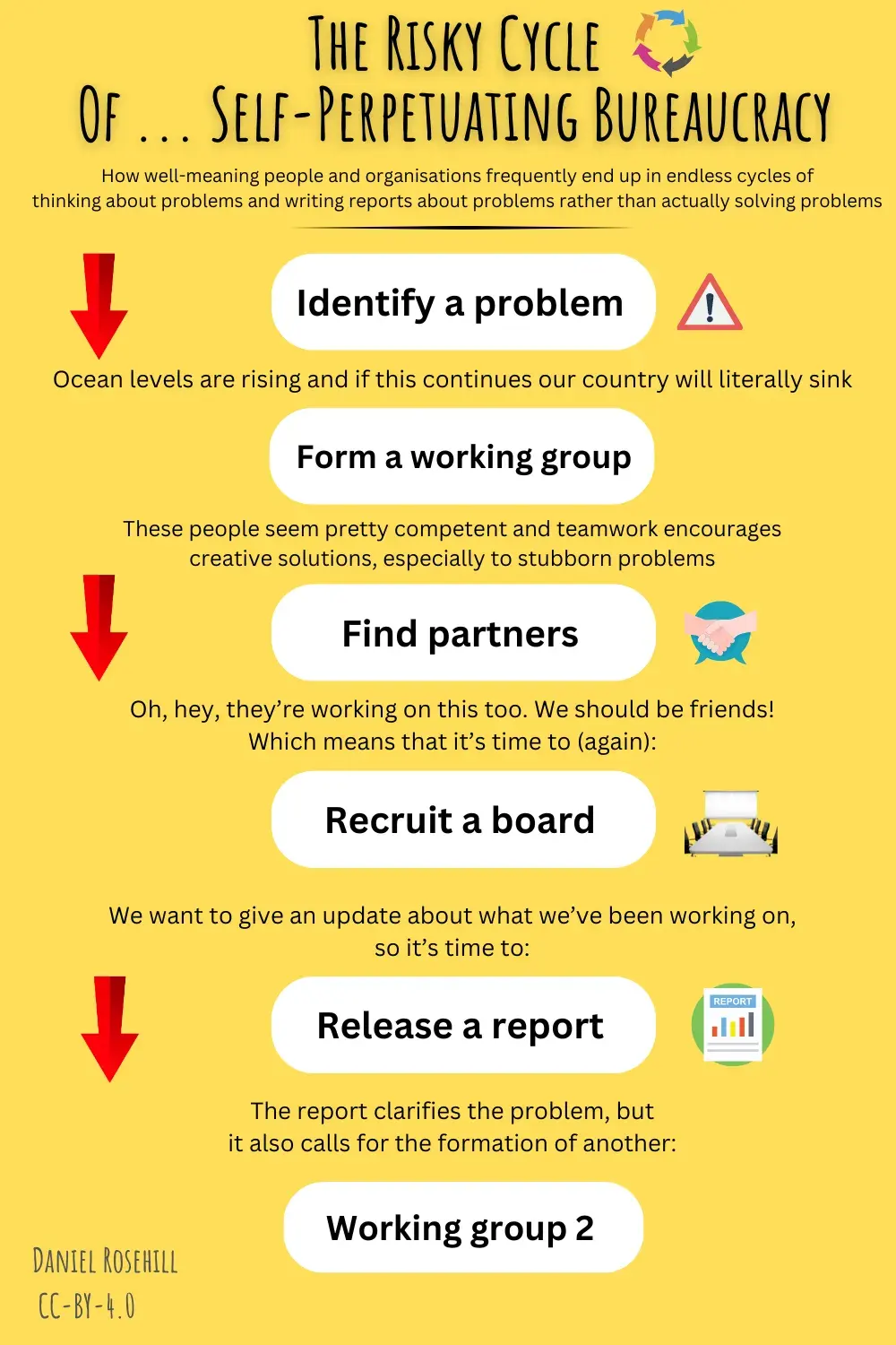
When mountains of material gets written, it can be hard to find insight - both for those working in a space and those on the outside.
And when we can’t communicate what matters to that pool of “stakeholders” … one wonders what the point of the effort is.

To the extent that data gets released, it too often tends to be locked up in long intimidating PDFs.
Besides being hard to read, it’s often difficult to really understand the contours of the data being released.
And the main issue I see with the business-as-normal approach is just as technical as it is communications-related:
Data gets released into a format that’s not machine-readable nor analysis-friendly
Which is precisely the opposite of what those sharing data would presumably like!
An important component of open-source ecosystems is the ability of third parties to step into other people’s work and improve on it.
In the context of data, that might look like third-party analysis of one’s data.
To encourage shared analysis, it seems sensible to offer up data in a machine-readable format.
A creative approach to doing this for policy-focused data has been followed by the INDIGO project housed within Oxford University whose work I have cited on the site.
INDIGO stands for the International Network for Data On Impact And Government Outcomes.
Borrowing some of the conventions of the open-source world they have:
To my mind at least, this is an excellent direction. Mirroring the calls for transparency that are frequently made in impact investing circles, the data is open, transparent, and even licensed under a friendly Creative Commons license replete with a handy natural language style explainer:
It’s a model for data publishing that I wish were used much more widely.
Communicating What Matters To Those Who Care

Caption: a sloth patiently reading impact data on a beach. Image: OpenAI / DALLE 3
The impact movement aims to make our world a better place.
Few, if any, would disagree with that noble objective.
But the individual contribution that any of those working in it makes is a small one.
It’s in that spirit that I say that the Impact Database is a small effort in a very big space.
Its main objectives are to curate data being shared by others; centralise it for ease of access; share visualisations and analysis to encourage others to do more of the same; and to uplift, in a small way, the collective analysis of impact-relevant-data, however you chose to design that.
If it achieves any of those things, it will have been an honest day’s work.
Notes
- These views are mine alone.
- Graphics: DALLE3 / OpenAI